A Skew-T is a graphical representation of the atmosphere using temperature, dewpoint and wind. And then using some math, offers a whole host of other meaningful weather information.
And it might looks scary the first few tiems you see a Skew-T graph. You might think, “well, just tell me what it says! I can’t read this!” but I promise that it is easier to read than you think and once you kw how to do it, it’ll change how you look at a weather forecast for the rest of your life.
Think of it like that scene in The Matrix where all the sudden Neo sees everything in code.

Yeah, that one! All the sudden, once he figures it all out, and fighting off the Agents becomes a breeze.
It’ll be just like that for you. Only you won’t be fighting off Agents in the Matrix, you’ll be fighting off bad forecast information from less-than-capable weather forecasters.
SKEW-T BASICS
Reading a Skew-T chart is really easy once you get accustomed to the layout. It is just like reading a line graph, only part of the chart is at an angle. This is because the values are on a log scale.
Really, you only need to worry about two lines when looking at a Skew-T. The red line, which is the temperature line. The green line, which is the dewpoint line. From there, you can understand so much about the entire atmosphere!
But because the graph is on a slant, the values that correspond to each point along both the temperatures and dewpoint lines are not directly underneath them, instead, they are off to the side a bit. I jokingly say, That’s why it is called a Skew-T… things are skewed to the side.”

Even though, that isn’t actually why it is called a Skew-T at all.
On the above Skew-t the temperature at “850” is 10-degrees Celsius. At “700” is is about 4-degrees Celsius. and at “500” the temperature is 13-degrees-below-zero Celsius. Cold!
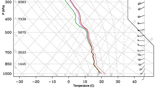
On the Skew-T here, the temperature at “850” is 9-degrees Celsius, it is 1-degree Celsius at “700” and up at “500” it is – again – 13-degrees-below-zero Celsius.
Aside from the different values at each “level” (850,700,500), the difference here is that the green line and the red line are closer together.
When they are really close together like this, it means the atmosphere is saturated. And depending on the situation, there is a chance for rain. When the lines are far apart, the atmosphere isn’t saturated. And can be quite dry.
Each “level” is actually an altitude in the atmosphere. So “850” is actually “850 hPa” or 850-hectapascals. A mouthful. We also call these millibars. It is easier to say 850 millibars. That means that “700” is 700 millibars. And so on. We shorten the word “millibars” to just “mb” often. In the weather world, we often drop the mb and just say the number “850” or “700” to make things quicker.
That means we don’t use altitude like you normally see it. No feet, miles, or kilometers, we use air pressure. This is done for a few different reasons. One it makes the math a bit easier. And second, we can shake out extra details when using constant air pressure as opposed to constant altitude.
The “1000mb” level is at the surface and the “500mb” level is up around 20,000ft
EXPANDING ON THINGS
So, looking at this next Skew-T, the first thing to notice is that there is a layer of pretty dry air just above the surface (1000mb), and up to about 400mb.
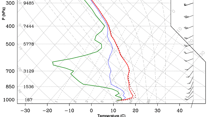
Then we can look at the temperatures. For this chart:
Surface: 11C
850mb: 10C
700mb: 5C
500mb: -12C
250mb -50C
Down around 1000mb the lines get really close together again. This may not signify rain, but instead, what happens when the air is saturated near the ground? Fog!
So looking at that Skew-T we see there is a lot of dry air up high, but closer to the ground there is saturated air. And maybe some fog. And that fog is trapped under an “inversion.” An inversion is when there is warmer air pancaked on top of cooler air. That setup stops vertical mixing from occurring and can often slow the fog from clearing.

The example Skew-T here is a good example of using a Skew-T to analyze the chance that precipitation falls as snow. In this case the “DGZ” where snow is made is above an inversion where the temperature is above-freezing. This means any snow that forms will melt on the way tot he surface.
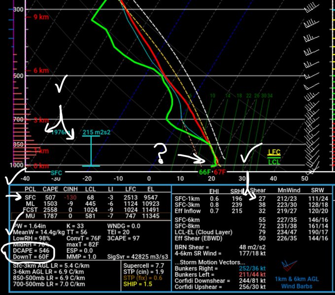
This example Skew-T shows that we hit a lot of the criteria to produce severe weather. Looking at all of the severe weather parameters offered by the data, we can see that we check a lot of boxes, with one question mark. The surface temperatures may be a bit cooler and that may limit the threat for tornadoes. Or it may be a case where the data is attempting to sample the downdraft within the Skew-T itself.
OTHER SKEW-Ts
Skew-T charts come in many shapes and sizes, too. The charts I started with were from Twisterdata.com. But the last two looked a bit different. Those were from PivotalWeather.com. So is the one below.

This Skew-T shows a pretty stout inversion. Temperatures at 1000mb are lower (about 0-degrees Celsius) than the temperature at 850mb (about 7-degrees Celsius). The air is saturated. There is some forcing (the purple lines on the left hand side) so precipitation may be falling. And liquid precipitation falling into temperatures at freezing means – freezing rain!
This next Skew-T is from the University of Wyoming.

This Skew-T is also showing an inversion. In this case the temperature near the ground, at 1000mb is about five-below-zero Celsius, while the temperature peaks around zero-degrees Celsius around 800mb. This Skew-T doesn’t have much extra information other than temperature, dewpoint and wind (barbs on the right side). Though, it does have a column of numbers on the right-hand side are many different meteorological parameters that forecasts use to help them interpret the data.
Sometimes there are even more numbers. For example, here is another look at a Skew-T from the Pivotal Weather site.

This one even has a hodograph (to measure wind speed and direction through the atmosphere).
Practicing reading different Skew-T charts can really help you gain a better understanding about why certain weather occurs at certain times. Why when it is below freezing is it not snowing? Why do certain shapes of snowflakes form on one day, but not the next? Why won’t the clouds clear out on a chilly day?
All of these questions – and more! – can be answered by having a good grasp of reading a Skew-T! Pretty soon you’ll read right through it. You won’t see lines and numbers anymore, you’ll just see “partly cloudy,” “rain,” “chance for snow,” etc.
And then you’ll come to the realization….

TEST YOUR KNOWLEDGE
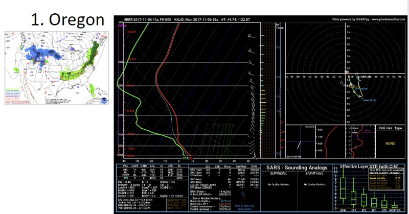
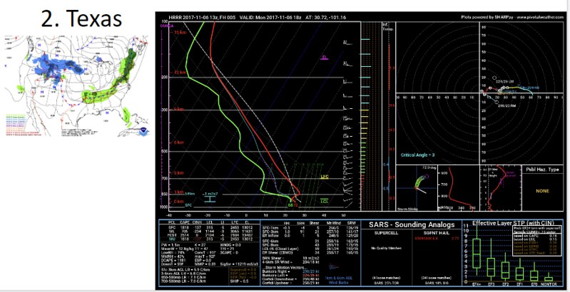
Take a peek at this map and check out the numbered areas and then look at how the Skew-T chart looks at each spot!

Here is each spot and the corresponding Skew-T…